web development China,web design China,website development company China,web development design China, Responsive Web Design, Too Necessary!
web development China,web design China,website development company China
If Your Links Aren't Mobile-Friendly, They'll Soon Drop Off the Radar!
In an era where a large portion of web traffic comes from mobile devices, it's no longer recommend to optimize your links for mobile traffic, it's essential that your website is designed to support traffic from a variety of devices with a multitude of screen sizes.
Previously, mobile-friendly web pages were encouraged and could help your ranking. However, now, if you choose not to make your website responsive, it could actually hurt your ranking.
Mobile-Friendliness As a Ranking Signal – Time is Ticking.
Google announced they’ll be updating their algorithms to expand the use of mobile-friendliness as a ranking signal starting April 21, 2015. See their full blog post, ‘Finding more mobile-friendly search results’ here. Essentially, mobile-friendly websites will be ranked higher in search engine results than websites that aren’t mobile-friendly.
This change simply reflects the needs in today’s evolving web browsing environment. People are conducting searches and accessing websites on a multitude of devices including: desktop computers, smartphones, tablets, gaming consoles, smart TVs, and even wearables, such as watches.
As an article writer and content marketer, it seems like a no-brainer to want your reader to be able to view your content regardless of what device they’re using. Furthermore, it’s important to ensure their user experience is as high-quality as possible. A page that displays poorly and is difficult to read or navigate means the viewer will spend less time on your site. Essentially, if you don’t optimize your website, you’re risking a drop in traffic for two reasons: a poor user experience and a lower ranking signal in search engines.
So, Make Your Links Responsive,Today!
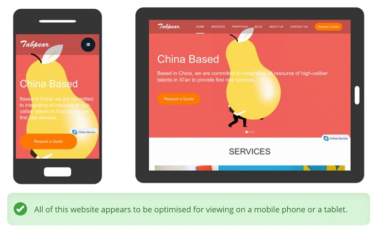
Tabpear.com has been 100% responsive. We’ve ensured our website has been able to display articles regardless of what technology readers are using. For that reason, we’re excited about the new algorithm updates as we’re already serving mobile traffic.
If you haven't already, now is the time to make your links responsive. It will help ensure visitors don’t leave due to a poorly designed website while lending a helping hand to your search engine visibility.
For further information and tips to make your website mobile-friendly, we recommend you check out our blog post titled, "Responsive Web Design-Good Design vs. Bad Design".
In addition, we recommend using Google’s Mobile-Friendly Test to check if your links are sufficient for mobile browsing.
Stay tuned for an upcoming post to learn more about responsive design.
Responsive means that a website will work on any device, even those that haven’t launched yet! It will not be constrained to fixed screen resolutions. Each website will no longer be confined to a desktop computer hidden away in the unused home office & it will no longer be scanned through as a quick distraction while at work. Each site will be available to anyone, anywhere on any device.